Previous Posts
- Week 10: Presenting is Part of the Project
- Week 9: The Challenge of Geospatial Data
- Week 8: Simple Solutions Work Better
- Week 7: Understanding the Data Behind the Display
- Week 6: Building Without Breaking
- Week 5: Correct Integration Saves Time
- Week 4: Data Integration Is More Complex Than It Looks
- Week 3: Turning Data Into Decisions
- Week 2: Making Data Actionable
- Week 1: Building Knowledge Before Making Changes
Goal
My main goal this week was to finish preparing my internship presentation and make sure I could clearly demonstrate the Storm Pointer dashboard, what I developed throughout the internship, and how Wet Dog Weather data was incorporated into the project. I also wanted to start thinking about what features I would work on after the presentation.
Workflow
I spent most of the week working on my final presentation. I went through the dashboard and decided which features were most important to demonstrate, recorded videos showing the different layers and tools, and worked on explaining how each part would actually be useful to a storm chaser. I also practiced the presentation and made adjustments to make sure I could fit everything into the allotted time without rushing through the important parts.
On Friday, I gave my final internship presentation, demonstrating the dashboard and the progress I made throughout the internship. I also spent some time brainstorming what I would work on next with the app. One area I would like to continue developing is the route section. I started looking at how construction and road information could eventually be incorporated into the route so a storm chaser could see potential issues along the way to a target.
Prompts Used
I used ChatGPT to help organize the flow of my PowerPoint presentation. I couldn’t decide whether I wanted the flow to start where a storm chaser would actually start or go down the line of features. I ended up going with the flow a storm chaser would actually use, saving the Wet Dog Weather data as a spotlight for last. I also used ChatGPT to generate my cover slide and end slide, and to create the basic design of the other slides to match Wet Dog Weather’s brand colors. I used PowerPoint to create the presentation and to upload videos showing the features. I used screen recordings from my videos.
What Worked
The presentation came together really well, and I was able to demonstrate a large amount of the dashboard without having to explain every individual feature in detail. Using short videos of the dashboard helped show how the different layers and tools actually function rather than relying only on screenshots. Working on the presentation gave me a chance to view the dashboard as a complete product rather than focusing on one development problem at a time. It helped me see what is already working well and where there is still room to expand it.
What Didn’t Work
There wasn’t a major development issue this week because most of my time was focused on preparing for and completing the presentation. The biggest challenge was deciding how much of the dashboard to include without making the presentation too long or overwhelming. There are many datasets and features available, so I had to narrow it down to those that best demonstrated the project’s overall purpose.
Lessons Learned
I learned that developing a tool is only part of the process. Being able to explain what the data means, why a feature matters, and how someone would actually use it is just as important. It also helped me look at the dashboard from the user’s perspective and think more about what I would want to improve next, especially with routing, construction information, and making the dashboard more useful during an actual chase.
Images/Video
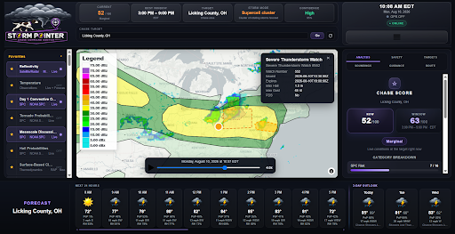
Image of completed dashboard
Point Forecasts Video
Wet Dog Weather & Storm Pointer Video