Previous Posts
- Week 9: The Challenge of Geospatial Data
- Week 8: Simple Solutions Work Better
- Week 7: Understanding the Data Behind the Display
- Week 6: Building Without Breaking
- Week 5: Correct Integration Saves Time
- Week 4: Data Integration Is More Complex Than It Looks
- Week 3: Turning Data Into Decisions
- Week 2: Making Data Actionable
- Week 1: Building Knowledge Before Making Changes
Goal
This week, the goal was to finalize the Storm Pointer dashboard by completing any remaining tweaks and begin preparing the final presentation and demonstration materials.
Workflow
This week I focused mainly on final tweaks and preparing for the internship showcase. I continued testing the dashboard and making small adjustments to make sure the different features were working and displaying correctly. Since the dashboard itself is mostly complete, I shifted much of my attention to figuring out the best way to present everything I worked on throughout the internship.
I started recording short videos and taking screenshots of the dashboard to use during the presentation. I wanted to capture the features in real weather rather than show an empty map, so I watched for areas experiencing significant storms and used those locations for some of the demonstrations. This took some patience because the weather did not always cooperate when I needed it to.
I also started planning the overall flow of the presentation. I am still deciding whether I want to use PowerPoint or Google Slides, especially since I want to embed several short videos. I worked on organizing the presentation so it follows a logical storm chasing workflow, beginning with real-time conditions and then moving through the different forecasting and analysis tools, including SPC products, satellite, mesoanalysis, point forecasts, soundings, the Storm Chaser Score, and routing.
Prompts Used
I used Cursor to help with final adjustments and troubleshooting within the dashboard. I also used ChatGPT to brainstorm the presentation structure, determine which dashboard features would be most important to demonstrate, and organize the slides into a logical workflow.
What Worked
Recording short, focused videos worked much better than trying to create one long demonstration of the entire dashboard. I was also able to capture some useful examples during active weather, which makes the features easier to understand than demonstrating them during quiet conditions. Planning the presentation around how someone would actually use the dashboard during a chase also helped everything start to come together.
What Didn’t Work
The biggest challenge was waiting for significant weather to occur in areas where I could clearly demonstrate certain features. Some products are much easier to explain when active storms, boundaries, warnings, or other features are visible. I also spent some time deciding how much information to include in the presentation because the dashboard has many features, and I do not want the presentation to feel overwhelming or turn into a long list of everything I built.
Lessons Learned
I learned that finishing the project is only part of the process. Figuring out how to clearly demonstrate and explain what I built is almost a project by itself. Going through the dashboard specifically for the presentation also helped me look at it from a user’s perspective and think more about which features are most important and how they work together during an actual storm chase.
Images/Video
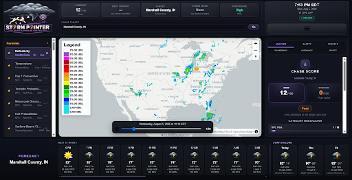
Image of complete dashboard
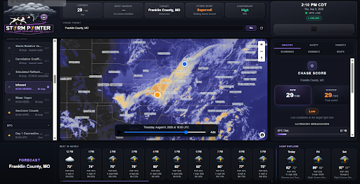
Image of IR satellite Image
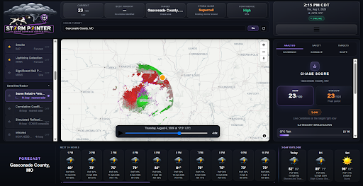
Image of velocity radar