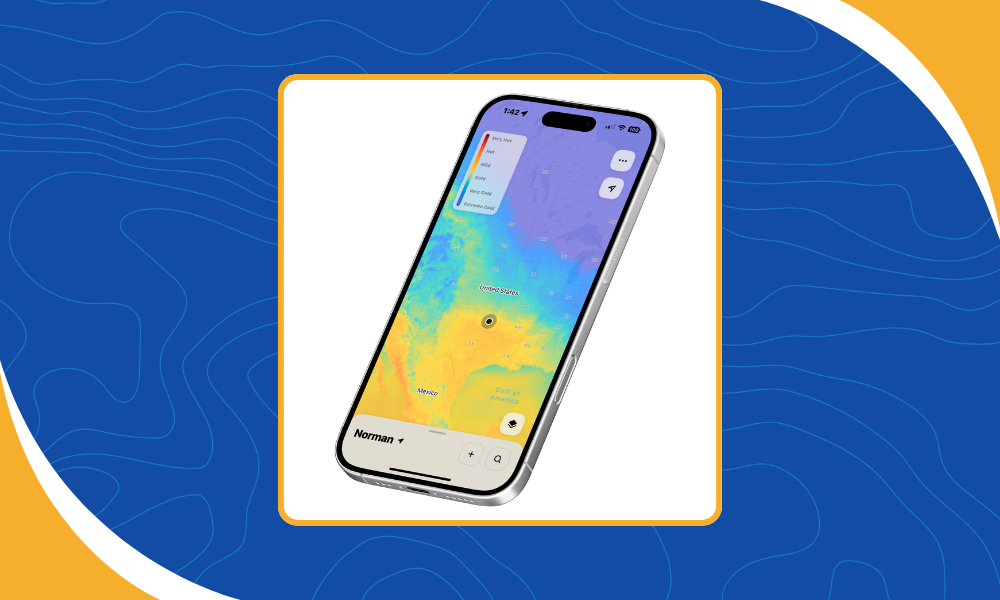
When most people open a weather app, they’re greeted by a familiar sight: a radar map showing rain and storms moving across the landscape. Radar has become synonymous with weather data, but it’s only one of many weather map layers that help people make informed decisions.
The best weather applications aren’t the ones with the most data. They’re the ones that present the right information at the right time, allowing users to quickly answer the question that matters most.
A pilot preparing for departure, a utility dispatcher monitoring the electric grid, and a family deciding whether to spend the afternoon outdoors all rely on weather data. The difference is that each needs a different combination of weather layers to make confident decisions.
Why Weather Map Layers Matter
One of the biggest mistakes in weather application design is assuming that more data automatically creates a better experience.
Adding every available weather layer can make a map feel cluttered and difficult to interpret. Instead, successful applications begin by understanding what the user is trying to accomplish.
Someone checking the forecast before walking the dog probably doesn’t need turbulence forecasts or soil moisture data. An emergency manager tracking a severe weather outbreak, on the other hand, needs far more context than radar alone can provide.
When selecting map layers for an application, start by identifying the decisions users need to make. Every additional layer should add meaningful context, not unnecessary complexity. A well-designed weather map isn’t measured by how many datasets it displays, but by how quickly users can find the information they need. By focusing on the user’s goals, developers can choose weather map layers that provide meaningful information instead of unnecessary distractions.
Planning a Flight Requires More Than Watching the Radar
For pilots, weather decisions extend well beyond precipitation.
Meandair Turbulence
A clear radar image doesn’t necessarily mean a smooth or safe flight. Winds aloft, turbulence, cloud ceilings, visibility, and icing potential all play important roles when planning a route. Together, these data layers provide a much more complete picture of current and forecast conditions than any single dataset can offer.
At Wet Dog Weather, Terrier displays these weather map layers as interactive visualizations, while Boxer processes the underlying weather models and observational data that power them.
Utilities Focus on Impacts Instead of Forecasts
Power utilities aren’t simply asking whether it’s going to rain. They’re trying to understand how weather will affect their infrastructure.
The weather itself is only part of the story. The real value comes from understanding its potential impact.
Strong wind gusts can damage power lines. Ice accumulation can bring down trees. Lightning increases the risk of outages, while wildfire conditions require utilities to closely monitor changing weather patterns.
Displaying these weather layers together allows operators to anticipate problems before they occur, position repair crews more effectively, and respond more quickly when severe weather arrives.
Emergency Managers Need the Full Picture
During severe weather, every minute counts.
St. Bernard
Emergency Operations Centers often monitor radar alongside watches and warnings, lightning, river levels, surface observations, forecast guidance, and other operational datasets. Viewing these data layers together helps emergency managers understand both current conditions and what may happen next.
No single weather layer tells the whole story during a rapidly changing event. Radar may show where storms are now, but warnings, lightning, river gauges, and forecast guidance help emergency managers understand what could happen next.
Simplicity Is a Feature for Consumer Apps
Consumer weather applications have a different challenge.
Carrot Weather
Most users aren’t looking for dozens of weather variables. They simply want to know whether they’ll need a jacket, if it’s going to rain, or whether it’s safe to head outside.
That’s why many of the most successful weather apps prioritize clarity over complexity. Radar, temperature, wind, and a concise forecast often provide everything users need, while additional weather map layers remain available for those who want a deeper look.
Good weather visualization isn’t about showing more information. It’s about making the most important information easy to understand.
Better Weather Map Layers Begin with Better Data
Every weather map layer starts long before it appears on a screen.
Weather models, radar, satellites, observations, and proprietary datasets all need to be collected, processed, and prepared before they can be displayed in an application. Behind every smooth animation or interactive map is a platform that ingests, processes, and delivers millions of weather observations and forecast values in near real time.
That’s where a modern weather data platform makes the difference. Systems like Boxer transform raw weather data into ready-to-use datasets, while Terrier displays those datasets as fast, interactive weather maps for web and mobile applications.
Whether you’re building software for aviation, utilities, emergency management, or consumer weather, choosing the right layers is about more than displaying data. It’s about delivering the information people need to make better decisions when it matters most.