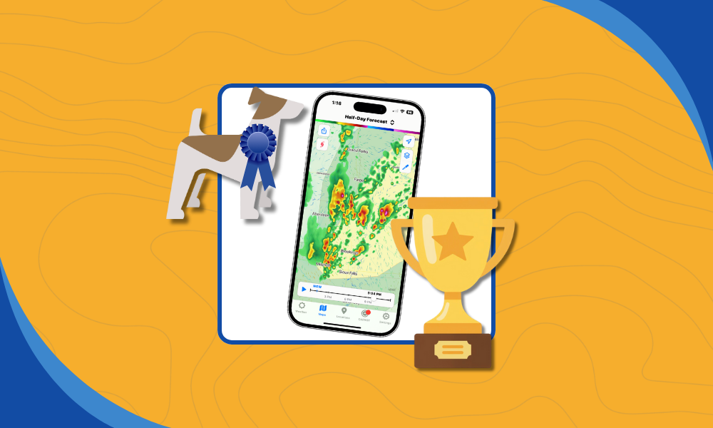
Terrier is our display toolkit for animated weather data. It’s a real-time WebGL JavaScript toolkit that our users can integrate into their MapLibre/Mapbox, OpenLayers, ESRI Map SDK, or Leaflet maps. We went to a lot of trouble to build it, and it’s worth talking about why. At its core, Terrier exists to solve a problem most map frameworks struggle with: real-time weather visualization.
Alternative: Web Map Tile Service
Using web map tiles works well for static maps, but it breaks down quickly when you need real-time weather visualization instead of a slideshow. Most people use map tiles, and they’re great! For maps. They’re awful for time series data, but we’ll get to that.
Map tiles and the Web Map Tiling System spec are what most people use. Well, actually, they use a sloppier version called TMS, but conceptually it’s the same. WMTS is the official version with OGC approval and the like, and it’s fairly popular in the weather domain.
WMTS has a time extension, but it’s not very well supported and has some problems. Even so, the issue isn’t so much on the WMTS side as it is on the display side.
Before we go tearing into why this is less performant, we do provide WMS and WMTS via our GeoService product. So if you need it, we got it. There’s just a better way.
Alternative: OpenLayers
Let’s pick on OpenLayers. It’s a fine toolkit, WMTS-compatible and even map projection-aware! That’s no mean feat, and OpenLayers is excellent. We use it for testing, and Terrier is compatible with it. But it’s bad with weather data.
What it provides is a Layer you can apply to a WMTS endpoint, and you can set the TIME, assuming you provided it (we do). In this fashion, you can iterate through your time slices, but not too fast! This is one of the first places where real-time weather visualization exposes assumptions baked into general-purpose map toolkits. If you go too fast, it gets confused.
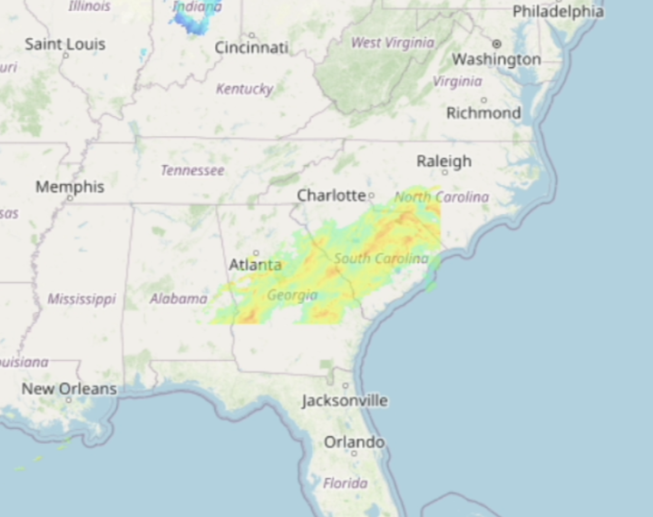
What’s going on in southern Georgia? It got confused by frequent TIME changes and got stuck. If you go slow enough, it can keep up. Mostly.
To be fair to OpenLayers, none of the standard map toolkits get this right. MapLibre/Mapbox, ArcGIS Maps SDK, and Leaflet all have trouble with weather data. So what do people do?
Alternative: Half-Aware Weather Display
One trick we’ve seen is a developer allocating one Layer per time slice.
It works up to a point, but it’s fundamentally at odds with real-time weather visualization at scale. In this way, they can iterate over time slices, turning them on and off as needed.
Clever, but it runs into a couple of problems. Can the toolkit enable and disable precisely enough for animation? And if it can, that’s going to use an enormous amount of memory. We had a customer doing this with ArcGIS Maps SDK, and they eventually had to give it up.
Terrier is Space Efficient
Terrier uses less than half the memory of that approach, allowing our users to display many more frames. We do this in a couple of ways.
First, we know the data is data, so we can represent it using only the space it needs. Radar, we can get away with 8 bits. For temperature and other variables, we’ll use 16 bits. That’s for display only; we retain the data in its original form for query.
When you display a map tile in, say, OpenLayers, it’s converted to RGB(A) and may require 2 to 4 times the space used for a Terrier data tile. That difference matters immediately when real-time weather visualization is constrained by GPU memory rather than map aesthetics.
Terrier is Smart With Coordinate Systems
But it’s not just the data tiles that are efficient; Terrier is smarter about map projections.
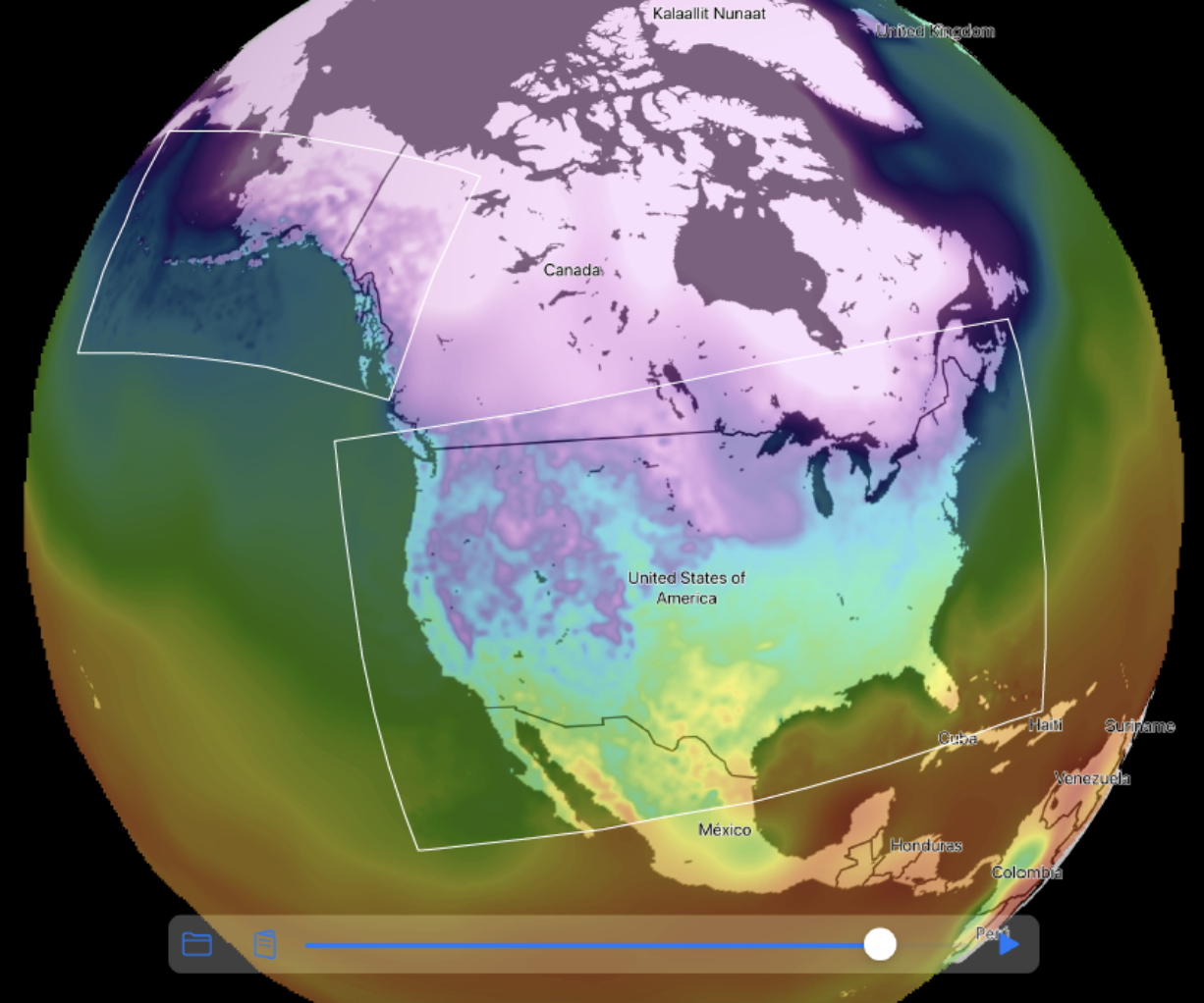
Here, we show GFS covering the entire globe, with HRRR over Alaska and the Continental US (CONUS). GFS is simple enough, but the HRRR data is in two separate Lambert Conformal Conic projections.
Most people will resample and reproject the data on the back end because most toolkits can’t handle multiple map projections. That assumption simplifies map rendering, but it’s a poor fit for real-time weather visualization, where latency and fidelity compete directly. Terrier can and does all this work on the display side.
This means we can leave the HRRR data coordinate system unchanged and perform the resampling in real time in the browser (or on a mobile device). Sure, it was complicated to implement, but so very easy to use. It looks fantastic because we’re not resampling data twice.
This approach also reduces download bandwidth and memory use, since we’re not oversampling and wasting pixels.
Terrier Applies Colormaps in Real Time
Another fun consequence of slinging data around is that Terrier can apply a colormap in real time. In fact, it has to, as the colormap isn’t baked into the data itself.
You’ve seen what our boring temperature colormap looks like. Here’s one from our customer, Flash Weather AI.
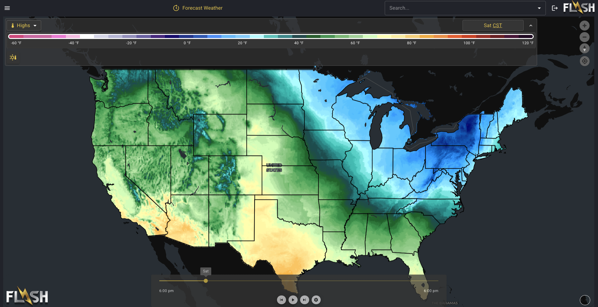
We’ll admit that looks a lot nicer than our default colormap. Here’s one from Element Weather.
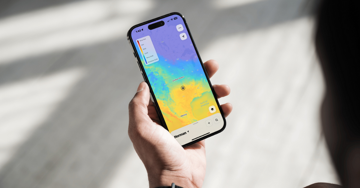
That’s really easy on the eyes. Maybe you have one you’d like better? It’s very easy to apply with Terrier. Heck, you can even switch them in real time!
Terrier Knows the Time
Most map toolkits, if they can display a series of images at all, treat them as a series of images. Terrier doesn’t do that because Terrier knows what time it is.
All the way down to the GPU shaders, Terrier knows the time and uses it in making decisions. Those decisions include what to display and how to blend it.
From the developer’s view, you just set the time in seconds from 1970, and Terrier figures out the rest.
Terrier Has a Very Smart Data Loader
We’ve been doing this kind of visualization for a long time, and we’re excited to see when other groups attempt it. There’s some neat stuff out there! But they always neglect the data loading.
Terrier assumes every tiled dataset is huge and only loads what it needs. That includes spatial dimensions as well as time. It focuses on what a user is currently viewing and when, loading frames ahead and behind before filling in everything else.
Terrier can also load multiple levels as it goes. It starts at a low level to fill in some data for the user, then moves to higher levels to get the full picture.
Loading is optimized for real-time display when a user is moving continuously. Thus, the logic can turn on a dime, cancel what it doesn’t need, and figure out what it does, reusing memory efficiently and making its decisions quickly.
Terrier Has Lower Bandwidth & Latency
Since we don’t resample the data to support simpler map toolkits, we send less data down to Terrier. As with memory usage, this has a measurable effect. Let’s pick on OpenLayers a bit more (sorry, OpenLayers, it’s not just you).

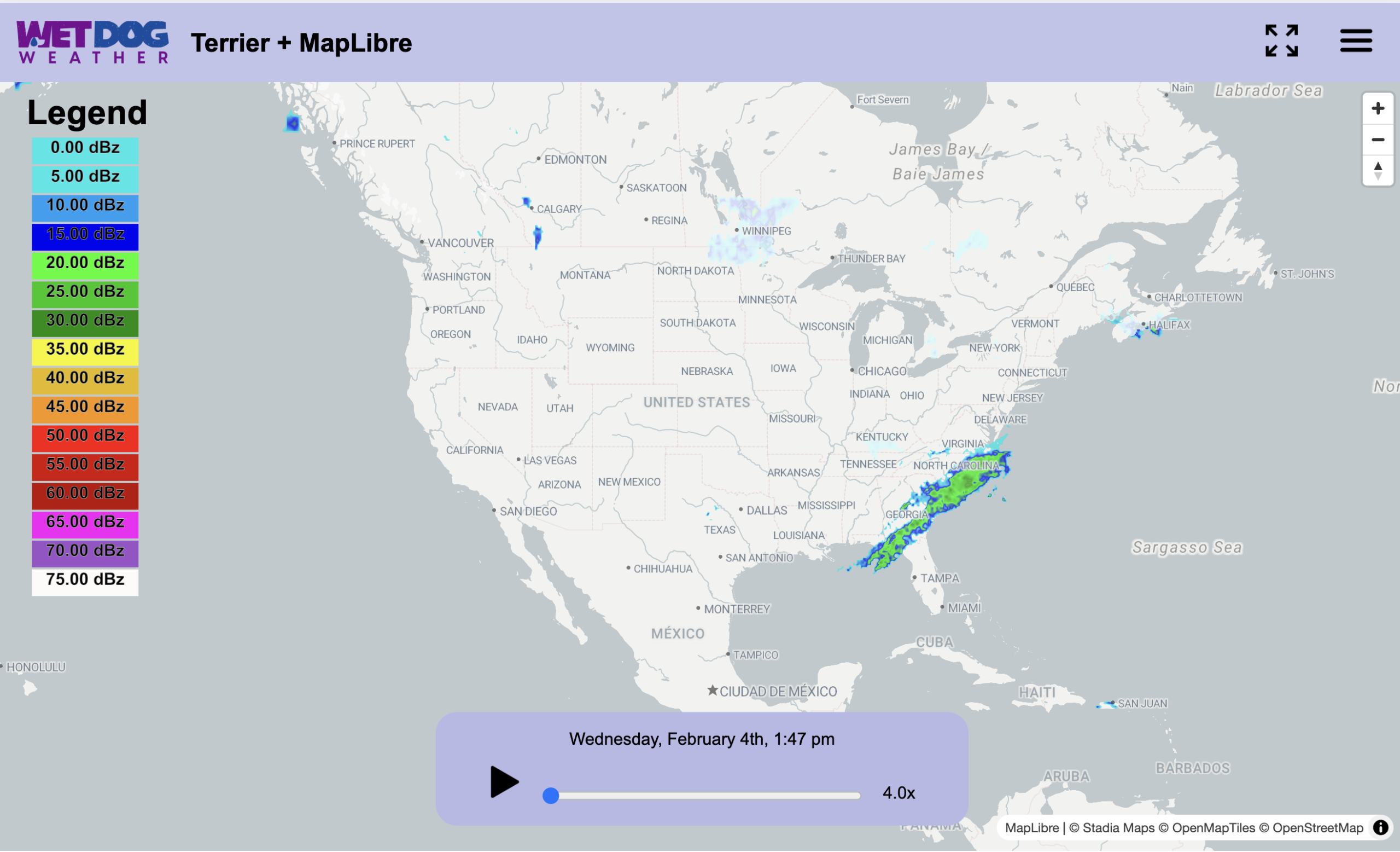
Pictured above is the Network graph from Chrome for the given Terrier radar display. It takes about 2.5s to load the full radar display, including all the frames.

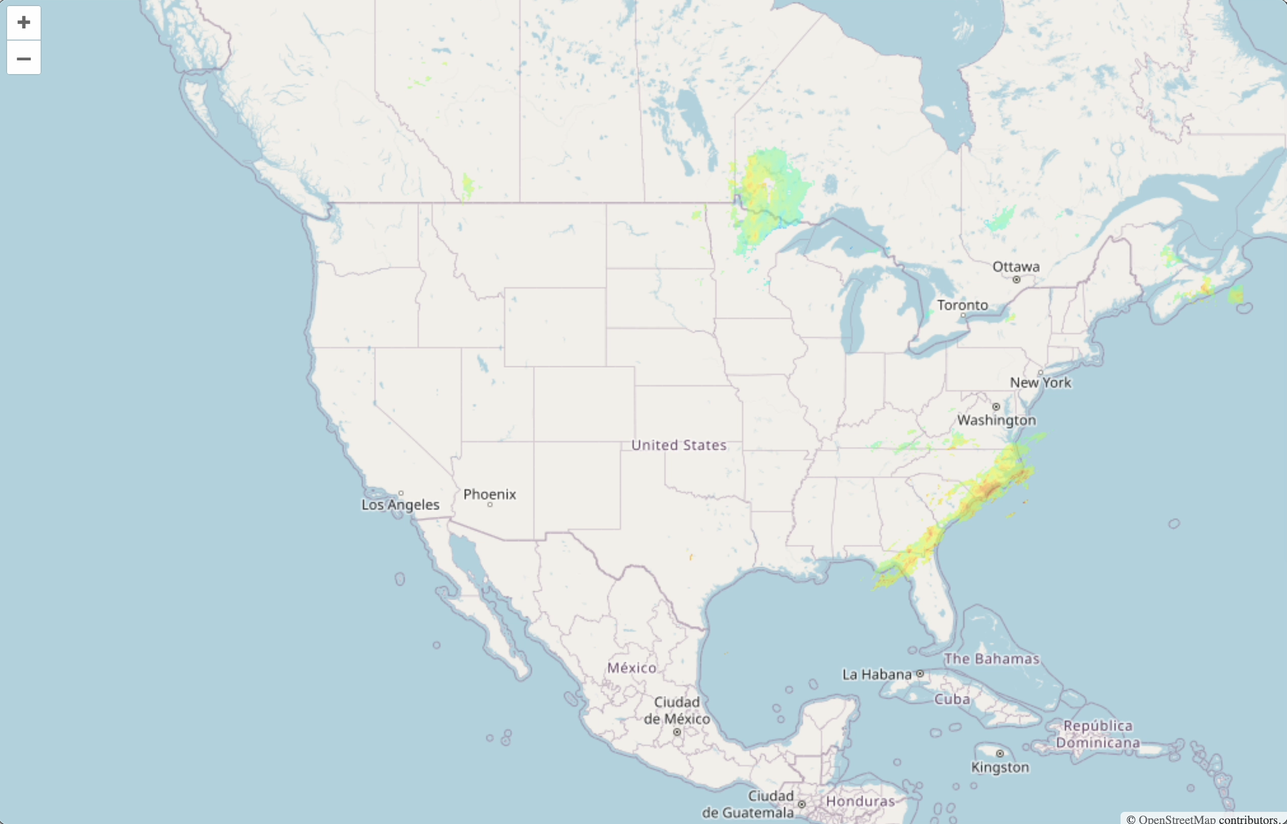
It’s a little tricky to make OpenLayer do the same thing, but we more or less did here. The equivalent loading time is 5.5s. It gets confused if you do that, which is why there’s a picture at the beginning, but that’s a separate issue.
Terrier is Just Better for Weather Display
We didn’t cover everything, like what we can do with wind, because we have data (particles & arrows). Or any of our tricks for making the data seamless across data tiles (not going to explain that one). Or how we fetch the metadata we need for a given data set, making our startup time much lower than the equivalent WMTS with Capabilities. If real-time weather visualization is a core requirement rather than a nice-to-have, the differences outlined above become hard to ignore.
If you’d like to see it, reach out, and we’ll set up a demo. Terrier really is better than a naive web mapping approach to weather data, and you’ll never look back.
