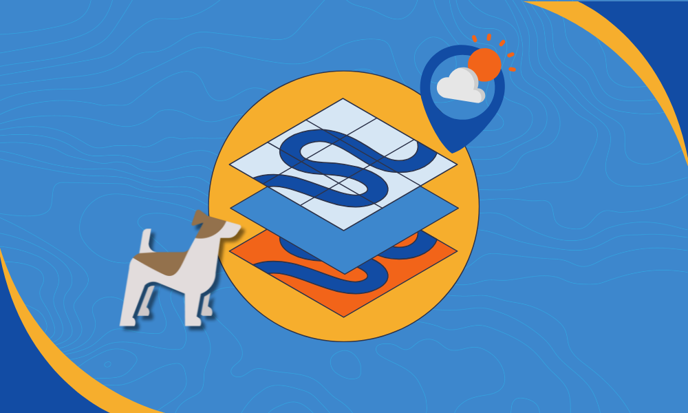
Want to know what the day has in store? A weather map is your go-to, but understanding weather map layers is key if you want it to be more than just a colorful image.
At Wet Dog Weather, we think of weather map layers as two distinct parts:
- The weather data itself: complex, dynamic, and interactive.
- The map base: less interactive, but still vital for context.
There are many ways to combine the two, and not all map toolkits treat weather map layers equally.
Layering vs. Integrating Weather Data
The old-school method? Slap weather data on top of a static map. It works—but barely. You make the weather semi-transparent so you can see roads or terrain beneath.
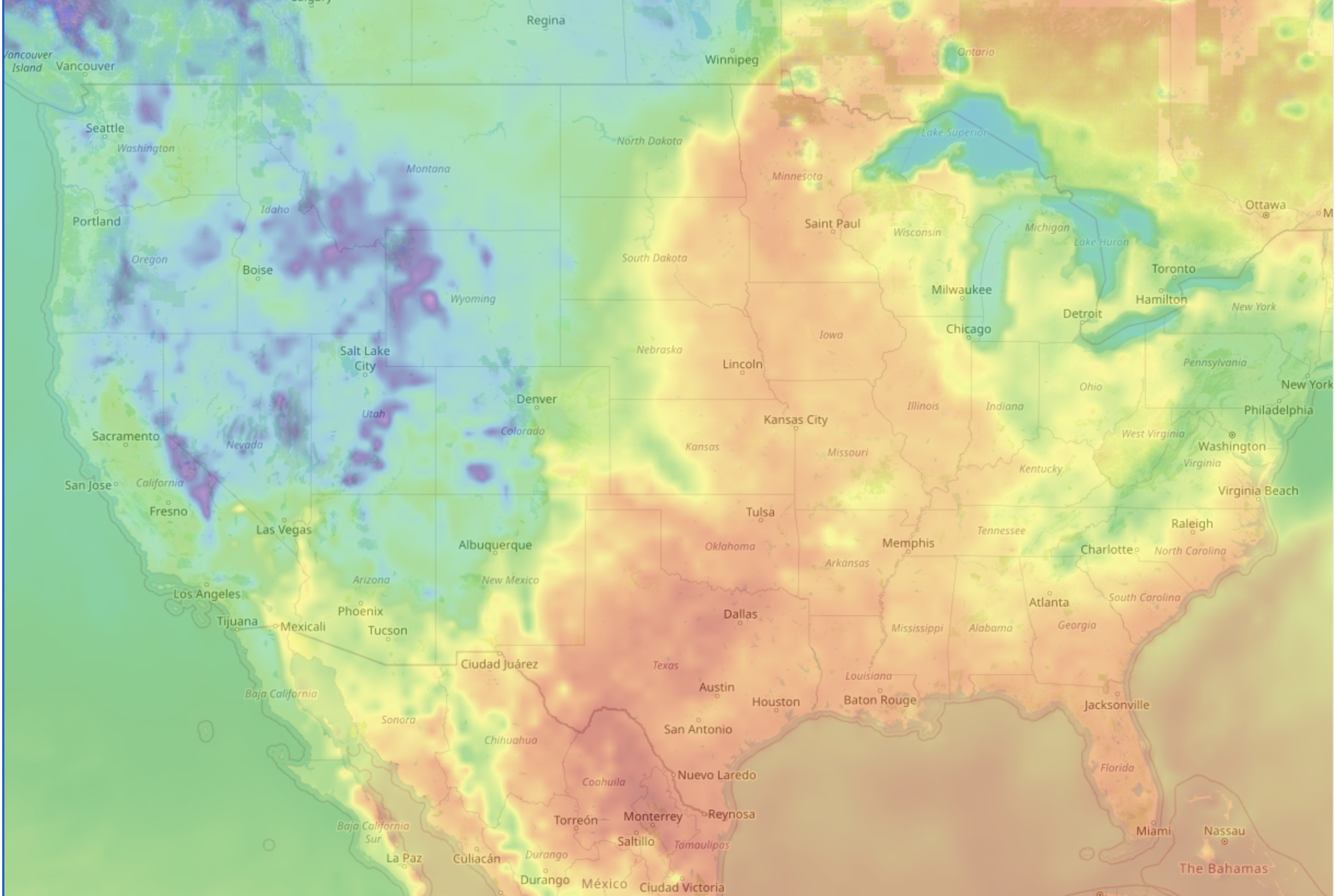
In this setup, everything—labels, terrain, borders—is baked into the base image. You can’t adjust anything, and the weather ends up blocking useful details.
However, with vector maps, weather map layers get way more interesting.
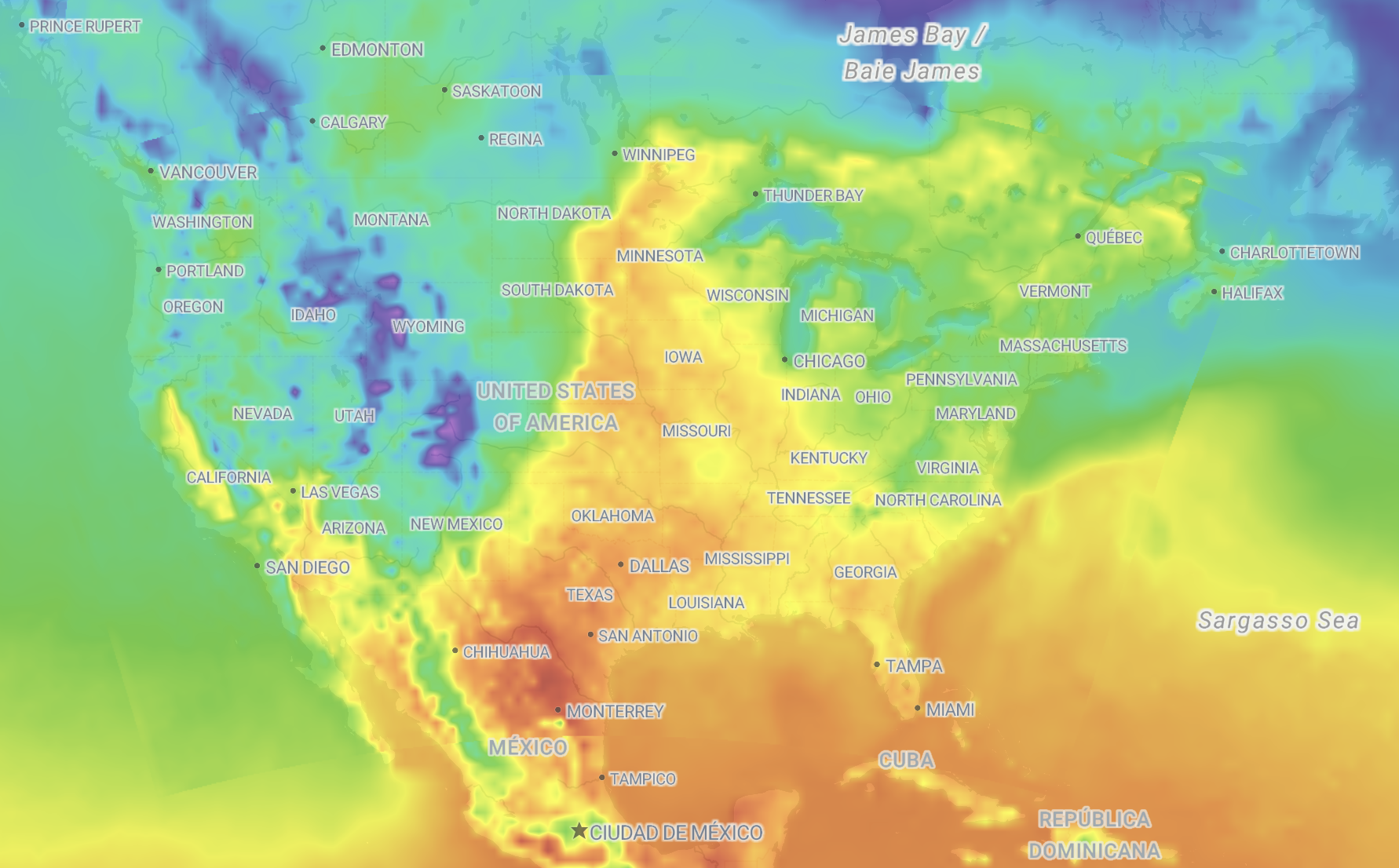
Now, each map element—labels, water, roads, country borders—is a separate layer. That means your weather data can live between them. With the right toolkit, you can position weather below the labels but above the terrain, making everything clearer.
It’s a small shift that makes a big difference.
How Terrier Handles Weather Map Layers
If you’re using Mapbox or MapLibre, Terrier makes weather map layers feel seamless. On the web, it works like this:
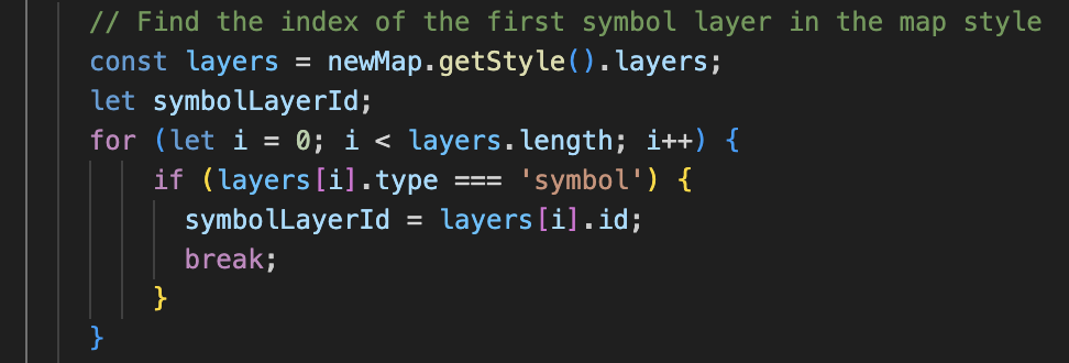
You pass in the layer ID when you start Terrier.
Change your base map style? No problem—you can reposition Terrier like this:
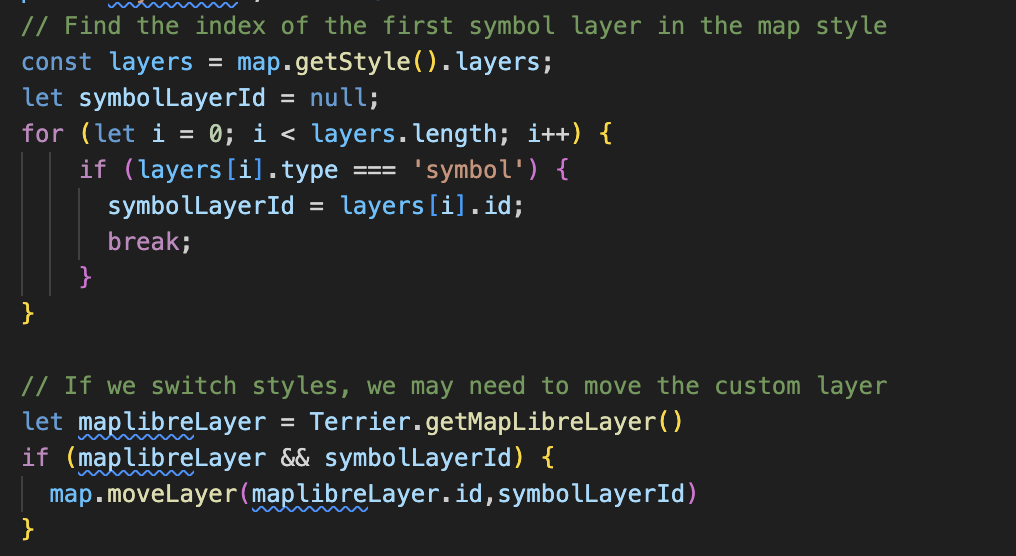
It’s flexible, lightweight, and built for web and mobile maps.
Choosing the Right Base Map
We’ve hooked up Stadia Maps to make our weather dashboards pop.
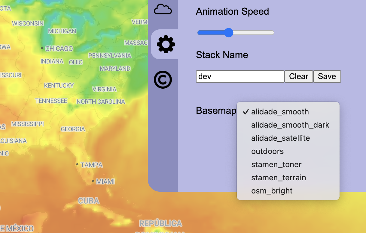
These base maps are gorgeous—and functional. Need dark backgrounds for light weather data? Covered. Want to layer radar reflectivity on top of satellite imagery? You can do that too.
One of our customers had a unique challenge with their weather map layers, which inspired us to add even more base map options.
The dark base maps are ideal for lighter-colored data sets. My absolute favorite has to be satellite, which looks impressive with radar reflectivity.
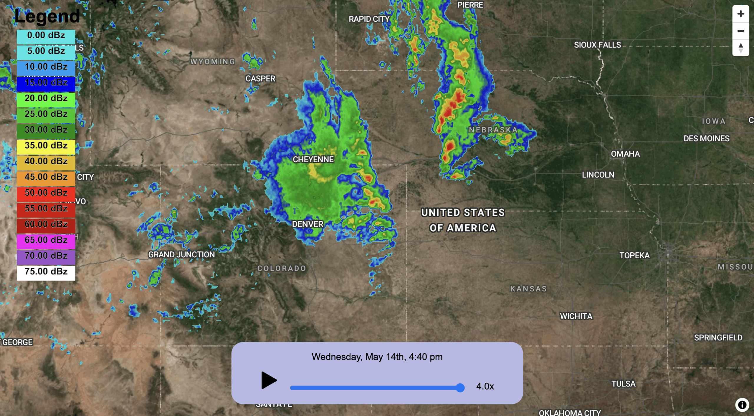
Vector maps like these help weather data shine—and help users make sense of what they’re seeing.
Best Practices for Weather Map Layers
Here’s what we’ve learned:
- Vector maps win. They let you stack your weather data between base layers and labels for the cleanest result.
- Labels go on top. Always. It’s the difference between “looks okay” and “looks professional.”
- Color control is everything. A good base map supports your weather layers, but does not compete with them.
- Add helpful outlines. Oceans, countries, and political borders make your map easier to read, especially on busy radar layers.
In short: the better your layering, the better your map. And that’s what weather map layers are all about.
