Individually, we have a long history with data visualization on mobile devices. Maybe you’ve used a weather app we’ve helped build. If you’re a pilot, maybe one of the electronic flight bag apps that uses our engine. But the web is new to us.
The Vision for Web-Based Data Visualization
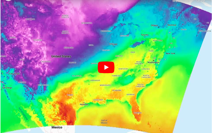
We took a big swing on promising Terrier, our visualization toolkit, would work on the web. We are close – here’s a sample.
That’s Terrier overlaid on top of Google Maps, animating a couple of days of HRRR temperature data.
Overcoming Technical Challenges
There are many moving parts to this, including the Boxer back end supplying the data in a displayable form. There are bugs, performance needs to be improved, and features need to be added. I won’t explain any of that in detail now.
Suffice it to say that we took a big swing at Wet Dog on this technology, and it’s a hit! To everyone who said, ‘Let’s talk when you’ve got the web,’ we’ll be reaching out.

